BLUSH FLOWERS


Project Overview
Developed BLUSH Flower catalogue and delivery app which is aesthetically appealing with a well organized layout, no clutter and seamless navigation for a florist which was made for avid flower enthusiasts, including those with low vision.
Role
UI / UX Design
Responsibilities
Conducting interviews, paper and digital wireframing, low and high-fidelity prototyping, conducting usability studies, accounting for accessibility, and iterating on designs.
Design Process

Research

Ideation with
lo fi designs

Hi fi Design

Evaluation and iteration
Research
Summary
Conducted online surveys with users of apps like Ferns n Petals and FlowerAura. Many users have problem with customer service, flowers not delivered on time, pathetic product quality and no refund. The worst pain points is the delivery of flowers on time, especially on special occasions such as Valentine’s day, Birthdays, anniversaries etc., and they receive dry, wilted flowers, which dissatisfies customers on those events. Also, navigation issues like scrolling in some screens when talkback is enabled.
Pain Points

Quality
Flowers shown in image and flowers received by customers are two different things.

Delivery
Disorganized delivery time and its time taken.

Customer Sevice
Delayed or no response from the customer service support.

Accessibility
Assistive technologies, though they work in apps, they are tough to navigate and scroll down in some screens.
Personas


For the rest of the case study, decided to select Lindsay and their user journey since they are visually impaired and those users are to be included.
User Journey Maps
User Journey maps for Persona Lindsay.
Goal: To order flowers without any hassle.

Ideation
User Flow
Post decision on user journey and goals, came up with the user flow for flower selection and ordering, followed by storyboards - big picture and close up and then, ideation with paper wireframes.

Storyboard

Big Picture

Close up
Paper Wireframes


Digital Wireframes


Testing & Iteration
Upon completion of the high fidelity prototype, went ahead with the testing of the prototype on users. A few participants provided feedback regarding a few details of the prototype:
High Contrast Screen, Menu Navigation and simplifying the checkout process.


High Contrast Screen
Menu Navigation
Simplifying the
checkout process.
The three important things were high contrast screen for low vision users, the menu that takes us to the catalogue and the checkout to complete the order. During usability studies, it was noted that the user found that the screen was white that was not appropriate for low vision, they were confused with the subcategory that is selected in the menu and the checkout process was overwhelming with too many screens.
Therefore, post usability study, for the menu navigation, side bar should open, followed by sub-categories. The selected category should be bolded while the checkout process was summarized with cart, checkout, date and time compressed to one screen, thus, making the experience smoother and their life easier. More importantly, the screen should be high contrast for low vision users to view and navigate better.
User Interface Design
Since the users included those with Visual Impairments, a high contrast black screen combined with color scheme of grey, white and pink along with magnified text and icons provides pleasing experience. The colors were, moreover, designated for each element - icons, text, buttons etc. The fonts used are Quicksand and Museo Slab as they are elegant and at the same time for better readability.

App Features
The app was also made for people with low vision and those new to technology. The overall app was simplified to just one screen with fewer buttons and icons, so all users do not get flustered.
Easier navigation is compulsory for users with visual impairment for overcoming design challenges, including app compatibility with inclusive and accessible features.
Scrolling down and up of some screens, when the Talkback was enabled increased difficulty in navigation and scrolling of other florist apps. Therefore, it was simplified to one page in a manner that we should be able to navigate even when Talkback and other screen readers are enabled. Moreover, popups are included for users to understand better.
Final Design

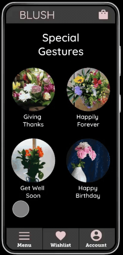
A minimalist and welcoming layout for homepage to avoid overload of images and for optimum navigation.
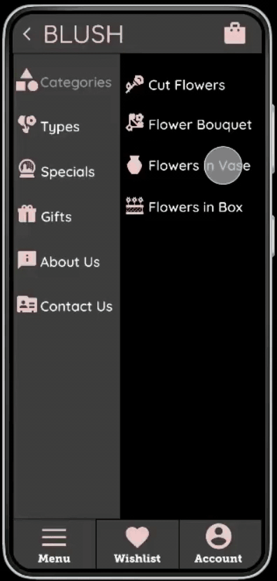
Menu with seamless access for navigation that is screen reader friendly.
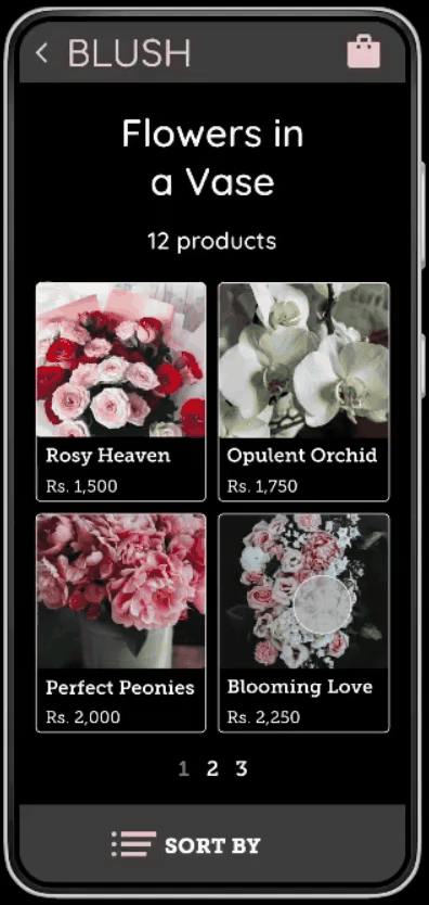
Decluttered one page catalogue with page numbers.
One page screen with salient pop ups that fuse the excitability, expanse of information and functionality.


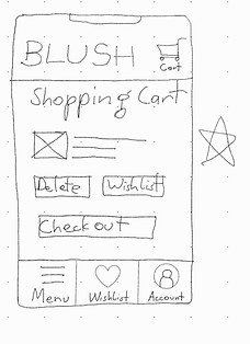
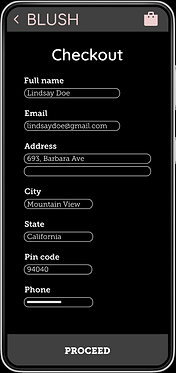
The cart page with date and time pop ups compressed to one page as a convenient alternative to other layouts where we needed to keep scrolling all the way down to provide details.


Takeaways
Impact
This app was indeed designed specially for low vision and those new to technology who need to order flowers for any ocassion.
A quote from user feedback: “Awesome. Amazing. Till now I have not seen anyone giving a care guide. Just have flowers delivered at your doorstep. That’s it. Even guiding them as to how to take care of them and maintaining the freshness.”
Learning
While designing the app, I learnt that iterations are a part of improvement of design.
Future Steps
Conduct another round of usability studies on more low vision users to determine whether their pain points have been addressed.
Conduct more user research to analyse any areas of requirements.