CASESTHETIC CUSTOM PHONE CASE


Project Overview
CASESTHETIC is a custom name phone case store that offers bespoke fashionable and designer phone cases in a spectrum of eco friendly and recycled materials along with various unique designs. The target user group is typically 18 and above who are innovators, designers, entrepreneurs, etc., who want their name or something inspirational on it. CASESTHETIC’s goal is to make shopping and customization efficient and easy.
Problem
Phone case websites are often claustrophobic with too many images, products received are different from the images displayed on the website and most of them may not fit on the mobile while viewing in landscape mode.
Role
UI / UX Design
Goal
Design CASESTHETIC website that is user friendly, accessible and screen reader friendly by coming up with one screen, navigation that is efficient, easy, cohesive and swift checkout process.
Responsibilities
Research, paper and digital wireframing, low and high-fidelity prototyping, conducting usability studies, keeping in mind accessibility, iterating on designs and responsive design.
Design Process

Research

Ideation

Hi fi Design

Evaluation and iteration
Research
Summary
Keeping in mind user research conducted, came up with empathy maps, User Story, problem statement and user journey maps to study deeper the target user and their needs. I found out that many target users treat online shopping as a favourite past time while taking time off from their otherwise hectic schedule to shop and customize their fashion accessories. However, many shopping websites are mostly congested with lots of images, content, difficult to navigate if screen readers are enabled and not all are optimized for mobile browsing, which frustrated many target users. Therefore, the time they have for shopping and personalization has become tough for them.
Pain Points

Layout
Disorganised layout with too much images and the content, making users difficult to finalize the product they want to order.

Quality
The products received are different from images displayed in the website.

Accessibility
When a screen reader for phone is enabled, it can be difficult to navigate – scroll down, thus, making it difficult to move forward. On the other hand, for the computer, it reads too much information displayed on the website, thus, confusing users.
User Story
The first step was to begin the design with a context, thus, came up with the user story below:
"Eli is a 20-year-old fashion design student. They study and do assignments during the day but also during the night, depending on the workload. Eli works in the institute from Monday to Saturday and an off day on Sunday. During free time, Eli likes to do online shopping or go to mall as a therapy. Eli lives with their cat."
Empathy Map

Developed empathy maps for deeper understanding of what the user says, thinks feels and does to get the gist of the problems they are facing.
Personas
.png)
Based on user story and empathy maps, came up with this persona to be considered.
User Journey Maps
User Journey maps for Persona Eli.
Goal: To shop online and order a bespoke phone case.

Ideation
User Flow
After user story, empathy map, personas, and user journey maps, arrived at the user flow, structuring information architecture, paper wireframes.

Ideation
Information Architecture

Paper Wireframes (Desktop Version)


Sketched out paper wireframes for each screen in website. Keeping the user pain points about website layout, images, content etc., front and centre.
The home page paper wireframe layout is minimized displaying only the featured image along with the featured magazines and popups – about, help, FAQ’s and contact to solve the problem of repetitive information.
Paper Wireframes (Screen Size Variation - Mobile)


Because CASESTHETIC’S customers access the site on various devices, included paper wireframe for additional screen sizes like mobile phones for an optimized, better responsive design.
Digital Wireframes


Digital Wireframes (Screen Size Variation - Mobile)


Testing & Iteration
Post lo fi prototypes, conducted usability testing of the website to analyze whether the main user experience, including finding, personalizing and buying phone cases is easy to finish. Also, to understand the challenges the users may encounter while browsing, ordering and completing the order.
The following findings gathered are given below:
1
FAQ's
The FAQ’s are crucial to know about the product before selecting and ordering a product.
2
Selected Images
(Reviews & Similar)
The reviews and similar products are important to determine what people say about the product and the other products available.
3
Colors for selected product
This option is compulsory as it is a bespoke phone case brand. It needs to stand out from any other custom phone case website.
Refining Design

As per the insights from the usability study, iterations were made by enabling FAQ feature and adding another screen. This spread awareness of users about the products before selecting and finalizing them.


To make this website unique from other custom phone case websites, color options had to be included.
Website Features

Enabling FAQ pop up spread awareness of users about the products before selecting and finalizing them.
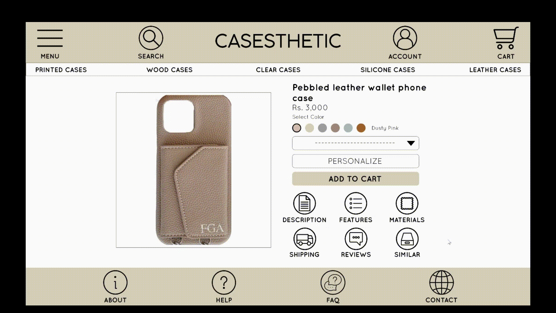
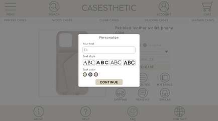
The menu was designed in a manner that the visuals only appear upon clicking on the menu button, taking us through the product catalogue and then the selected product where we get to select the color, phone model and name personalization with font choices.
Pop ups for features like FAQ’s, About, Contact, Description, Features, Reviews, etc., to help users with assistive technologies for enhanced experience during navigation of site.
User Interface Design

For a high end custom phone case website, preferred to use neutral color scheme of sand color, grey, white and black and a classy font of Quicksand.
Final Design
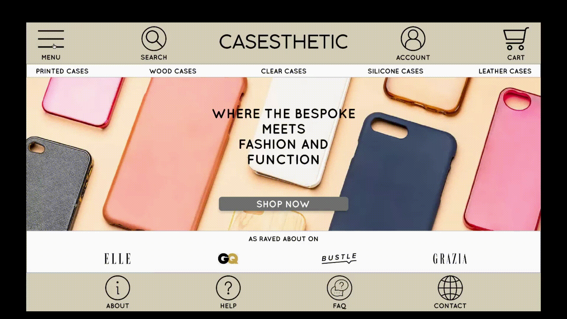
Homepage
User flow started off with the homepage, divided into 4 parts:
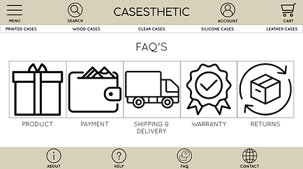
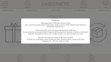
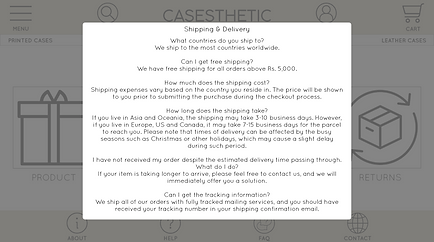
1. FAQ's
2. Browsing of products
3. Product Selection
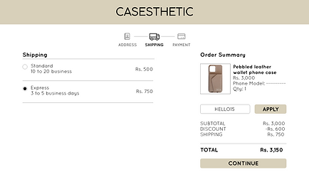
4. Checking out and confirming order

Icons in the footer help simplifying the information, instead of repetition.
1. FAQ's - know more about the phone cases they will be buying

Boxes that direct us to various topics to know about the phone cases.


2. Browsing of products - menu that pops up for us to select the type of phone cases before browsing the catalogue.


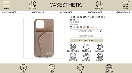
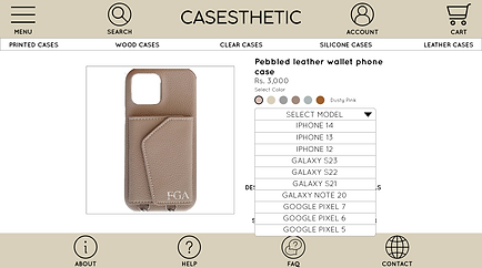
3. Product selection - model selection, name personalization, checking the description, features, reviews etc., before adding to cart


4. Check out and order confirmation


Screen size variation - mobile


Takeaways
Impact
Target users said that the website is clean and that the navigation is easy in just 2 to 3 clicks. Also, each process is straightforward and the boxes in the selected item – description, features etc., is well thought of.
Learning
Incorporating compulsory changes to important features makes the user aware of the products they are buying for enhanced user experience. The most important takeaway for me is to always keep the user needs and pain points at the back of your mind while designing a product.
Future Steps
Conduct second round of usability testing on the website on more users.
Look for feedback and pain points - additional areas of needs, iterate and ideate on new features.