DECO BOUTIQUE CAFE


Project Overview
DECO Café is a cross platform web3 app and website also catering to motor impaired users. The motor impaired users need to place orders from their convenience of home using accessible features. DECO Café’s target users include professionals and students who belong to the upper middle class and upper class families.
Problem
Menu is very lengthy with lot of items, making it tough to select items to be ordered. Apps will only operate if location access is enabled.
Role
UX designer spearheading the app and responsive website design from concept to completion
Goal
Design a Boutique café food delivery cross platform app that help motor impaired users browse, select an item and place order in an efficient way.
Responsibilities
Conducting interviews, paper and digital wireframing, low and high-fidelity prototyping, conducting usability studies, keeping in mind accessibility, design iterations, deciding on information architecture, and responsive website design.
Design Process

Research

Ideation

Hi fi Design

Evaluation and iteration
Research
Summary
Used DECO Cafe’s data on other cafes to develop interview questions, which were then used to conduct user interviews. Most users struggled with the menu browsing part, which is very lengthy and overwhelming and app not functioning without enabling location access. Based on reviews, the users needed a food delivery app and responsive website that is accessible with hassle free navigation and where they get to enter the location manually and get their order delivered at their doorstep.
Pain Points

Accessibility
Apps may not be compatible with accessible features.

Layout
Menu is extremely lengthy, making it cumbersome for users to select, finalize item and confirm order.

Location
Many apps only work if location access is enabled.
Personas


Went ahead with both personas since each user was unique.
User Journey Maps
User Journey maps for Persona Julia.
Goal: Determine the fastest way to finalize what food or drink they want to order.

User Journey maps for Persona Avery.
Goal: To order from the mobile itself even without location permission instead of waiting in the long queues.

Ideation
User Flow
Keeping the problems, goals, pain points, personas of both Julia and Avery and their user journey maps intact, developed the user flow to take the brainstorming of information architecture, paper and digital wireframes forward.

Information Architecture

Ideation
Paper Wireframes


Digital Wireframes


Testing & Iteration
Right after lo fi prototypes, conducted usability testing to determine the usability and desirability of the features for motor impaired users. This will make it helpful and easier to encourage such users to order food and beverage. The following findings gathered are given below:
1
Item
Customization
People want this process to be simplified.
2
Payment
People faced difficulty in finding payment gateway.
3
Screen size during usability testing
People want a smaller screen for testing prototype for better experience.
Refining Design


Item Customization
Payment
User Interface Design

Since it is a luxury boutique cafe, for a rich feel, golden beige has been used as a standard color for the accent with white for the background and black for text and icons. Comfortaa font was used as it was soothing to the eye.
App Features
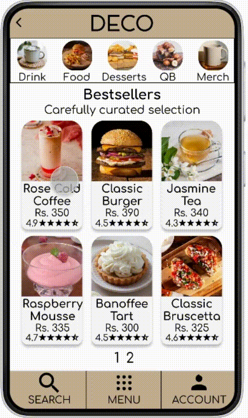
Easy to access menu particularly helps motor impaired users to select items effectively.
Item 1 Selection & Customization - toppings for a cold coffee - size, milk, non dairy, whipped cream, syrup and other addons for users to better make choices based on their preference.
Item 2 Selection and Customization - toppings for a mousse - base, sweetener and egg / eggless irrespective of whether users are veg or non veg.
Item 3 Selection & Customization - toppings for an iced tea - size, sweetener and ice for users to better choose wisely whether they like it cold or room temperature.
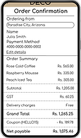
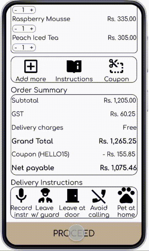
Checkout - selection of delivery type in cart, applying coupon in the order, then clicking on the delivery instructions as per user requirements and even safety before proceeding to payment.
During payment stage, only the email, credit card details, state, country and pin code are provided as it keeps the user info discreet and we don't need to provide automatic access to the entire location, we can enter it manually for enhanced safety of users.
Final Design


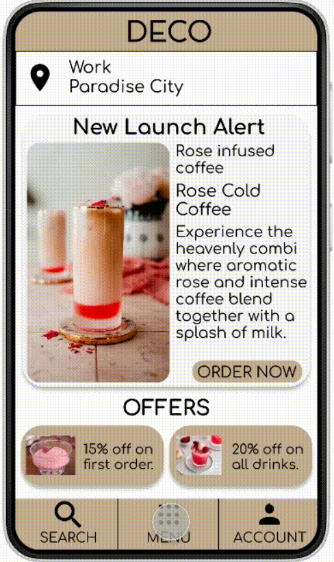
Location entered manually not just allows app to function but also protects privacy of users.
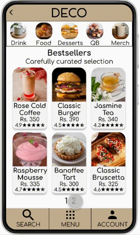
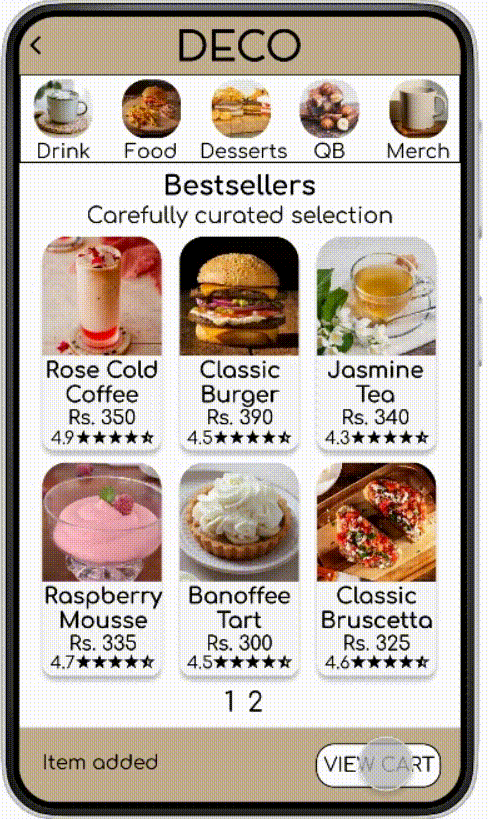
Easy to access menu particularly helps motor impaired users to select items effectively.
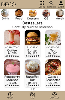
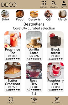
One page menu that is not just easy to navigate but also users can finalize and select items they want to order in an effective way.


Users can navigate between 2 pages to make choices instead of a long list that is frustrating and lengthy.


Even the topping customization has been clarified with popups for all users to make their selection in an apt way before adding to cart.

Popups (icons) for delivery type benefit customers in deciding whether they want delivery, takeaway or dine in, however they want.


Delivery instructions options considering privacy and safety of users.
Coupons for first time users
Stripe was used in the payment method given that it is a Web3 app and website.
A simple way to embed crypto purchases directly into our checkout flow and credit cards, debit cards, accepts popular payment methods around the world—all with a single integration.


Responsive Website Designs
Came up with design for screen size variation - mobile, tablet, and desktop. Designs were utilized to meet specific user needs of each device and screen size.
Mockups (Responsive Web Design - Mobile)


Mockups (Responsive Web Design - Tablet)


Mockups (Responsive Web Design - Desktop)


Takeaways
Impact
Users shared that the app made food ordering process simple and easy to use. One quote from peer feedback was that “The app was simple and easy to use.”
Learning
Learnt that even though the problem that was to solve was significant, going through each step of design process and adhering to specific user needs and feedback helped come up with design that was both effective and aesthetically pleasing.
Future Steps
Conduct research on motor impaired users to determine the usability and feedback on the features of this app and website.
Be aware of the trends regarding accessibility, including visual and motor impairments to make design changes.